I want to leave the Dynamic Island
The UI feature on modern iPhones isn't fixing the broken notifications system.


I bought an iPhone 15 a few months ago, and it’s my first experience with Apple’s modern smartphone design. That includes the “Dynamic Island,” the large cutout at the top of the screen that displays persistent notifications in the part not taken up by the cameras. I thought it was kind of neat at first, but it’s really just making the already-bad status system on iPhones even worse.
Ever since the iPhone X, Apple’s full-screen phones had a giant cutout at the top of the screen, usually referred to as the “notch.” Even as most of the competition had a much smaller cutout for the front-facing camera, the iPhone had more sensors for Face ID, so the notch remained. That changed with the iPhone 14 Pro, when the notch was slightly shrunk and had some of the screen wrapped around at the top. That design has now carried over to the entire iPhone 15 series.
Apple decided to turn the minor redesign into a feature, dubbing it the “Dynamic Island.” Incoming calls, alarms, and other elements now expand from the pill-shaped void. The space between and around the cameras can also be used as something like the status icons on macOS or Windows, with timers, visualizers for music playback, tethering status, and more. Holding down on the island expands the activity into a notification-like popup, working around the space taken up by the cameras. You can see it in action in the video below, or in Apple’s iPhone 14 Pro reveal from last year.
Apple also allows apps using Live Activities on the lock screen to display information in the island area. Uber uses it to show the ETA for drivers, Carrot Weather can show a rain chart, and so on.
That all sounds pretty cool! For the first week or so, it seemed like a useful addition and a creative way to work around the screen void created by front-facing cameras. The more I used it, though, the more it seems like another duct-tape solution for the iPhone’s problems with notifications and persistent information.
Now you see it, now you don’t
The first big problem with the Dynamic Island is that information only appears there with an ongoing activity: you have a timer running, you’re playing music, and so on. That makes sense. However, as soon as those activities are paused, the panel can go away completely.
The worst example of this is playing music from apps like Spotify and Apple Music. When I pause a song, the activity remains at the top of the screen for a few seconds, and then goes away completely. If I want to resume that song, I can’t do it from the Dynamic Island — I have to do it from the Control Center or the original app. It’s not confusing if you’re already used to iPhones, but it seems like bad interface design for the most accessible playback controls to suddenly disappear.
I’ve run into the same issue with podcast playback, but it doesn’t seem to affect some other types of activities that can be paused, such as timers. I’m not sure if there’s a good solution for music or podcast playback at all, because it doesn’t really make sense for paused audio to stay there forever.
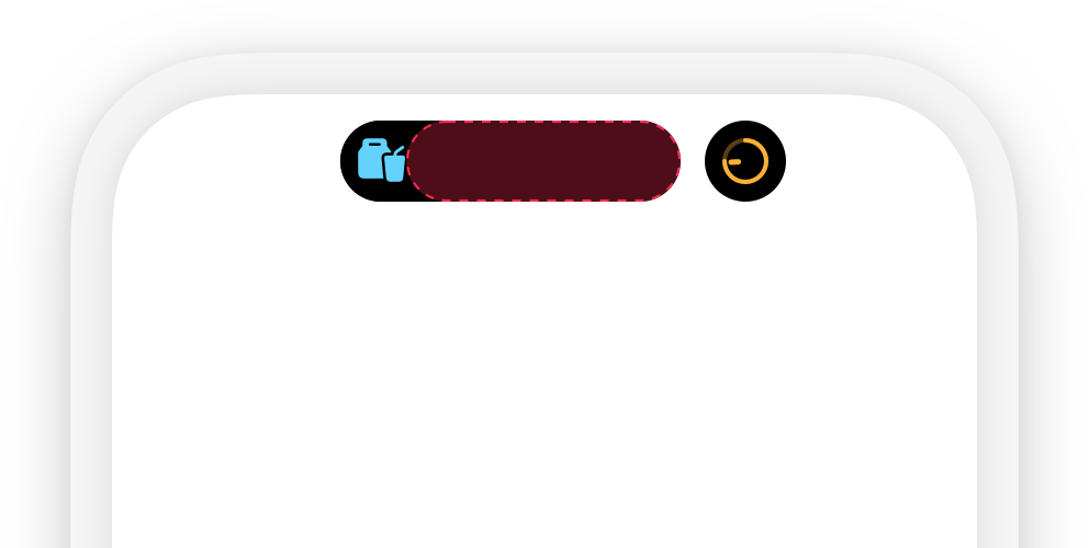
If you have multiple activities, like if your Wi-Fi hotspot is enabled while playing music, the iPhone will split them across the available space with less information visible. Apple calls these the “compact and minimal presentations." Applications can create multiple live activities and set the priority for them to appear in the Dynamic Island, but the iPhone appears to be random when choosing between activities from different apps and the system.
Start from scratch
The core problem with the Dynamic Island feature is the same one with notifications and status icons on iPhone as a whole: there’s just not enough space. The curved corners on modern iPhones reduce how much information can fit into the status bar, and the notch and island take up about half of the remaining screen space. The clock, battery level, and signal indicators are always visible on the screen, and Apple doesn’t allow apps to display anything between the camera cutouts (presumably because that could change on future iPhone models).
Even on older iPhones that don’t have part of the status bar missing, there’s no option for a notification indicator. I have no idea if I have important notifications on my iPhone unless I remember to open the notification panel occasionally, or if I see a red dot on my home screen. Google figured this out 15 years ago on the original Android phone: each notification displays an icon in the status bar until it’s dismissed. Many Android phones also have screen cutouts, but there’s still at least one dot visible at all times, telling you at a quick glance that something needs your attention.
The Apple Watch has had an indicator for unread notifications on the watch face for years. Why is that not on the iPhone? Why, instead of adding that as an option, did Apple create a whole new UI feature to take up all remaining space in the status bar? The Dynamic Island is kind of cool, but if I could trade it for a notification indicator, I’d do that in a heartbeat.
Apple’s phones and tablets still desperately need an overhauled notification and activities system that more closely matches Android. The Dynamic Island feels like it’s moving away from that goal, rather than towards it.